Community Relations Branding
Mizuho’s Community Relations team (CRU) is focused on creating opportunities to do good in our communities. While the team’s efforts create positive impact, its internal brand lacked a unified identity, creating confusion among employees about the scope of CRU’s efforts and purpose. This was an opportunity to redefine CRU’s image and raise awareness by creating a cohesive visual experience that resonates with employees.
The goal was to craft a robust visual framework that would seamlessly integrate all of CRUs pillars, while enabling them to stand on their own, preserving their unique purpose.
Role:
Research, concept, design
Awards:
GDUSA American Inhouse Design Awards, in the Branding + Identity Programs category

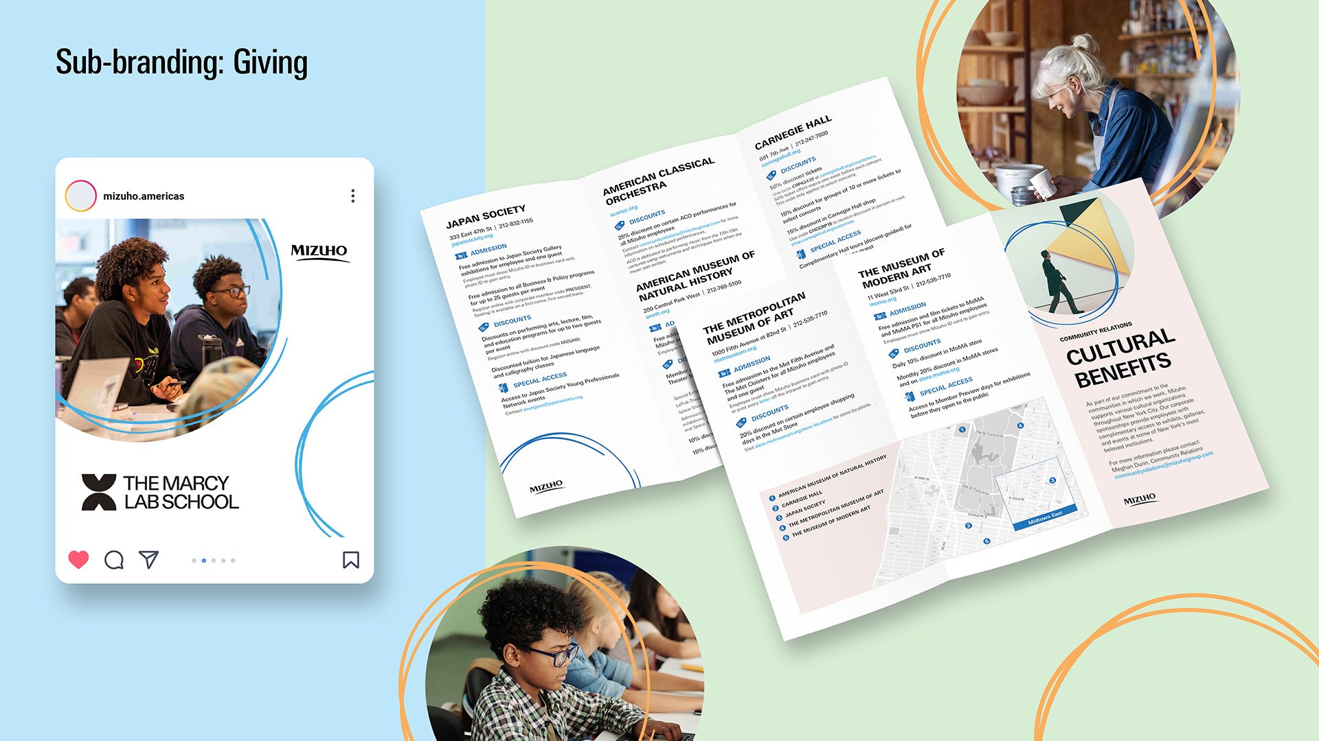
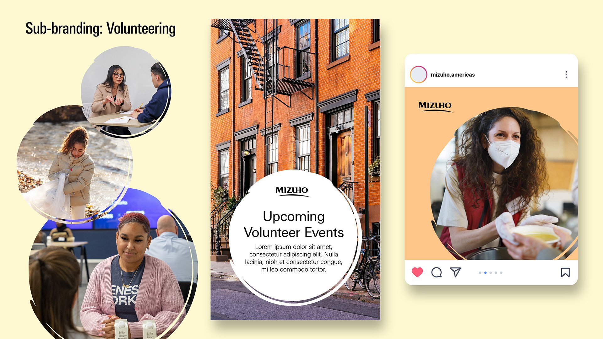
A key aspect of CRU is empowering employees to engage and make a tangible impact. To accomplish this, we combined the circle, a universally recognized symbol of togetherness, with "drawn" strokes to symbolize intent and focus, ultimately creating a concept that resonates with the emotional depth of unity and serves as a dynamic frame and connection to narratives in every communication. Each pillar stands on its own as a full circle. When all four pillars come together, it creates a circle that shows the complete story of Mizuho Community Relations.

Giving back: hand-drawn circle is off-centered to add interest to the composition and spotlight a person or people

Investing in the community: the half circle emphasizes community members while background imagery provides context


Sustainability: circular paintbrush stroke highlights the human aspect of ESG and what people are capable of doing